Reading the Dashboard Contents
The Application Monitoring dashboard displays bar graphs, historical graphs, pie charts, cord diagrams and tables.
The exact values of the various curves, fields, etc. can be read precisely:
![]()
![]() Bar graphs
and pie charts
Bar graphs
and pie charts
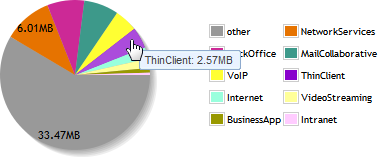
| • | You can read the exact values on a bar graph or on a pie chart, by moving your mouse over them. A small pop-up appears with the field name and its value: |
| • | You can access a Site view by clicking on its bar in a bar graph. |
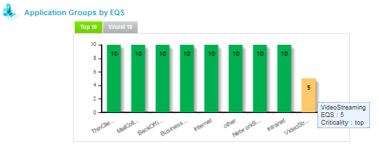
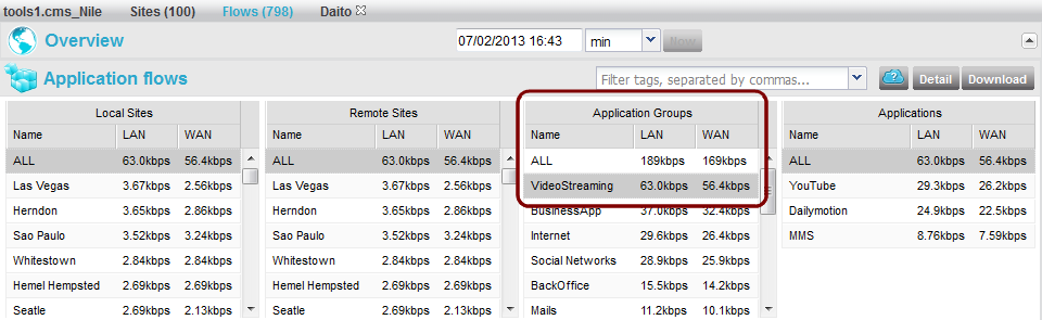
| • | You can access the Flows view filtered out to match an Application Group by clicking this AG in a bar graph or in a pie chart. For instance, clicking on VideoStreaming in the Application Groups by EQS graph in the Client view shows the flows belonging to the VideoStreaming AG: |
Filtering the flows list by clicking on a graph (1)
Filtering the flows list by clicking on a graph (2)
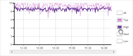
![]() Historical graphs
Historical graphs
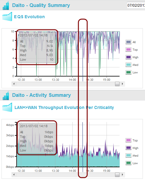
| • | You can read the exact values of historical graphs by moving your mouse over them. A vertical bar then appears on the graph, with a pop-up indicating the exact time and the exact values of each curve; the same vertical bar and pop-up also appear in the other historical graphs of the view, thus allowing a synchronized navigation and reading of all the graphs: |
Reading various historical graphs' exact values at the same time
| • | You can change the time (of the entire page) by clicking anywhere in these graphs; the time then changes to the clicked moment. |
| • | You can highlight any curve by rolling over its legend, and you can hide or show it by clicking its legend. In the example below, you display the Top and High traffic, highlighting the High curve. |
| • | You can export any graph, both in PNG and CSV formats, by right-clicking it. |