Create a Custom Chart

Use Data Studio to create a custom chart that displays the data that you want to see.
  1. Click the Business Insights navigation icon and select Data Studio.
  2. Click Create Chart.
  3. Under Chart Details, select values from the following drop-down fields:
    • Chart Type—Select Time Series, Bar or Pie.

    • Data Source—Select the source of the data. Choose from Access Point Table, Mobile Unit Table or Application Table.

      Note

      Note

      Data for the Access Point and Mobile Unit tables are sourced from the controller that you deploy. Data for the Application Table is sourced from traffic sensor data.
    • Metric—Choose the aggregation logic to display for the selected measurement, for example maximum, minimum, or mean.

    • Metric Operation—Choose the aggregation logic to display for the selected measurement, for example maximum, minimum, or mean.

    • Group By—Choose how to organize the data, for example by access point name or operating system.

      Note

      Note

      The actual values under each drop-down may change slightly depending on which options you select and on your implementation of Business Insights.
  4. Select Open Query Builder and construct a query.
    A query is a set of conditions, associated by AND or OR operators. For example, you might want to collect data for the set of APs with a particular name AND IP address, OR with the same manufacturer.
    The following image shows a sample query being defined in the Query Builder.
    Click to expand in new window
    Query Builder Example
    Query Builder, showing three conditions being defined: Access point name, SSID, and Channel Frequency. The first two conditions are linked by OR. Together they are linked by AND with the third condition.
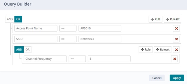
    • Click + Rule to define a condition, for example Location != Concourse. Click within the boxes and choose the criteria (like Location) and operations (like !=) to add to the rule.

    • To define additional conditions, click + Rule again, define the new conditions as you defined the first condition. Associate the conditions with each other using AND or OR.

    • To create a group of conditions, select + Ruleset and define rules within the ruleset. Then use AND or OR to associate the rules within the ruleset, and to associate the ruleset with other rules and rulesets you have defined.

  5. When you are finished building the query, select Apply to save it.
  6. Select a specific event on which to run a preview report:
    1. Choose an event by selecting appropriate values from the drop-down menus across the top of the main window.
    2. Click Run Report.
      ExtremeCloud Business Insights for Venues applies your query to the selected event and then builds a chart based on the criteria that you selected in step 3. If you are not satisfied with how the chart looks, modify chart details and run new reports until you are satisfied with the chart.
  7. Click Save and enter the following details:
    • Chart Name—Enter the Chart Name that identifies the chart within the ExtremeCloud Business Insights for Venues SDK.
    • Chart title—Enter the title that displays at the top of the chart.
    • Chart Description—Enter a chart description for the custom chart.
  8. Click Save.
The new chart gets added to the Chart Library and can be added to any of your custom dashboards.