ExtremeCloud Business Insights for Venues displays event data in dashboards. Each dashboard contains charts and figures that show wireless client data usage during one or more events.
Business Insights groups dashboards under four categories that are available under the Dashboards navigation item:
Note
By default, Business Insights reports event data in one-minute intervals.Many dashboards and charts have extra requirements. For example, many dashboards and charts require you to deploy ExtremeCloud IQ Controller.
To view requirements, hover your mouse over the Dashboard Description or Chart Description tooltip
icon  for the applicable
dashboard or chart.
for the applicable
dashboard or chart.
If a dashboard or chart shows no data, you may not meet the requirements for that data. Review the requirements in the tooltips. If the chart or dashboard still does not work, check with an Extreme Networks representative to ensure that your network meets the minimum requirements.
While working in dashboards, use the following icons and controls to customize how your dashboard and charts display.
| Icons | Description |
|---|---|
|
The tooltip provides dashboard descriptions (where available) and chart descriptions. For the description, hover your mouse over the tooltip that appears within a dashboard label or within a chart. |
 |
Dashboard Settings—Use this icon to change the dashboard layout. Within a dashboard, click this icon and then select the desired layout. |
 |
Create New Dashboard—Within the Custom Dashboards page, click the plus (+) icon to create a new custom dashboard. |
 |
Download Dashboard (PDF)—Click this icon to download the displayed dashboard in PDF format. |
 |
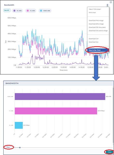
Chart context menu—Click this icon in the top right of a chart and select from a list of available actions, for example you can:
|
 |
See All—Within applicable charts, click and unclick this label to display or hide all categories from the chart display. Note:
You can also display and hide individual categories from the chart using either of these methods:
|
| Delete—Click the trashcan icon to delete a custom dashboard or event. |