User Templates

Configure > Splash Template > User Templates.
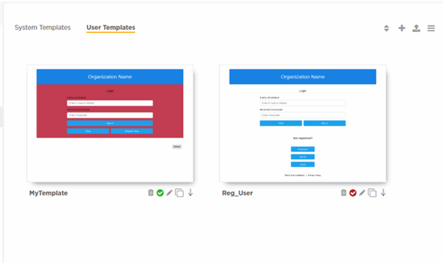
The User Templates screen displays a summary of captive portal splash templates hosted by ExtremeGuest Essentials.
- upload a splash template from your local file system.
- apply splash template to a network.
- edit an existing splash template.
- create a new splash template.
- view splash template to network mapping summary.
Follow the steps below to upload, edit, create a splash template or get a summary view of existing templates.
Uploading Splash Templates
-
Select the User Templates
tab.
The User Templates screen displays.
 Splash Template - User Templates Screen
-
Select the
 icon at the top right corner of the screen.
The Upload Template window opens.
 User Templates - Upload Template Screen
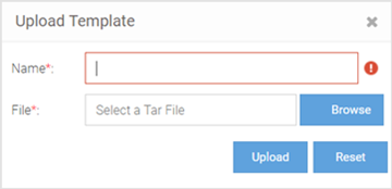
- Enter a name for the template, select Browse and navigate your local file system to locate and select the splash template file.
-
Select Upload.
The selected splash template is uploaded to ExtremeGuest Essentials from your local system.
Applying Splash Templates to Networks
Splash templates displayed on the User Templates screen can be applied to networks.
-
Select
 to
apply the captive portal template to a network.
Note
The icon indicates that the template is already
applied to a network. The
  icon indicates that the template has been changed after it has been
applied to a network.The Apply template window opens.
 Apply Template to Network Screen
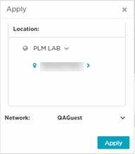 Refer the table below for details:
Location Map the captive portal page with one or more locations. When mapped, the APs within one or more locations serve the captive portal pages to guest users, either directly or through the ExtremeGuest Essentials web server. Expand the Location tree to view the locations (RF Domains) defined within your network. Drill down to the last node and select a site. Or, select any one of the upper nodes (country, state, region, or campus) to apply the captive portal pages to multiple sites.
Network Select the  icon to view available
networks. Select the network to which this captive
portal provides access.
icon to view available
networks. Select the network to which this captive
portal provides access.When selected, guest users attempting access to the specified network are required to authenticate with the captive portal and are allowed access only if successfully authenticated.
Apply Select to activate the captive portal template. Note: The Apply button is enabled only if the mode of distribution, location, and network settings are specified. -
Select
 to
download a template locally.
-
Select
 to
delete a template.
-
Select
 to
edit a template.
Viewing Splash Templates to Network Mapping Summary
-
To view a summary of splash
template to network mappings, select the
 icon.
icon.

Note
For information about this screen and its content, see Viewing a Summary of Available Splash Templates. -
To return to the default view,
select the
 icon.
icon.
Creating/Editing Splash Templates
The User Templates screen provides a robust, easy-to-use splash template builder wizard. Use the wizard's 'drag & drop' elements, color, text and language customization tools and logo upload options to create your branded captive portal web pages.
-
To create a new splash template,
select the
 icon.
To edit an existing template, select the
 icon below
the template. The template opens in the edit mode.The Create Splash Template screen opens.
 Create Splash Template Screen
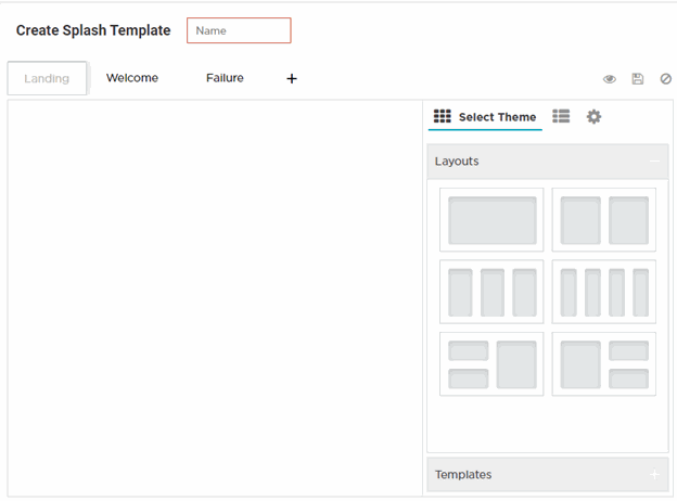
- Enter a name for the splash template. Provide a name that uniquely identifies its purpose.
-
Select the type of web pages
your users will be served.

Note
Below the Name field is the splash template page tabs. By default the following three tabs are displayed: Landing, Welcome and Failure. -
To add pages, select
 and select the Login page.

Note
You can remove all other splash template pages except the Landing page. To remove a page, place the cursor on the tab and select the icon.
icon. -
Select a splash template tab to
add or edit the page contents.

Note
The add/edit page screen is divided into a bigger, main pane and a right-hand panel. Each splash page type has its own collection of themes, widgets and page settings options that are displayed in the right-hand panel. These options are the building components that you will use to build your page content. -
Select Select
Theme.
Themes divide the page into sections/cells, which are place holders for widgets. To add widgets, you need to first place themes on the splash page. Themes are grouped into Layouts and Templates. Perform one or both of the following tasks:
- Expand the Layouts section. You have six layout themes to select. Each layout theme has one or more cells. Each cell can contain only one widget. Drag and drop one or more layout onto the main splash template pane.
- Expand the Templates section. Templates are layouts with pre-filled text and/or image widgets. You have five template themes to select. Drag and drop one or more template onto the main splash template pane.

Note
When creating the page layout, take into consideration the various elements (text, image, buttons, login options, etc.) that you plan at add to the page.The Select Theme menu displays. Create Splash Template - Select Theme Options
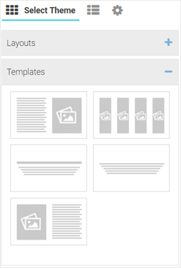

Note
You can use multiple layouts or templates or a combination of layouts and templates to divide the page into sections. The height of these sections can be adjusted by dragging the bottom margins. -
Once the themes are added, you
can perform following actions:
-
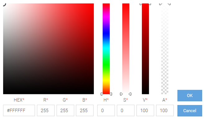
Change background color
of a layout or template. Select the
 icon to open the built-in color palette.
Select the background color and select OK
.
The Color Palette displays.
 Create Splash Template - Built-in Color Palette
-
Reset background color.
Select the
 icon to reset background color to
transparent.
-
Remove a layout or
template. Select the
 icon to remove the layout or
template.
-
Change background color
of a layout or template. Select the
-
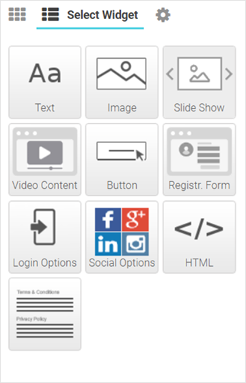
Select Select
Widget.
The Select Widget menu displays.
 Create Splash Template - Select Widget Options
-
Drag and drop a widget into the
layouts/templates on the splash page. The following are the available widget
types:
Text Widget Adds text to the page. Image Widget Adds image to the page. HTML Widget Adds HTML content to the page. Use this widget to design your web page from scratch, without using any of the system-provided themes or widgets. Slide Show Widget Adds a slide-show component to the page, using the images available in the gallery. Video Content Widget Adds video to the page. Button Widget Adds any button with a per-defined hyperlink to a page. Registration Form Widget Adds a registration form to the page. Users are served an internal (or) externally hosted registration page where they have to complete the registration process if not previously registered. Login Options Widget Adds buttons that enable “Accept and Connect” action or go to “Login” page action Social Options Widget Adds social media sign-in options. Terms and Conditions Widget Adds “Terms and Conditions” and “Privacy Policy” hyperlinks with pop-up texts. Login Form Widget Adds a simple login form with “Email or Mobile” and “Received Passcode” fields. WiFi Logout Widget Adds button that enables the user to logout from connected WiFi. Redirect Widget Adds a redirection URL to the web page. 
Note
Each of the above widgets has two icon tools on the top, right corner of the widget bar. Use the icon to edit the widget settings, use the
 icon to remove the widget.
Editing Text Widget
Use this widget to insert content/text in the web page. The ExtremeGuest Essentials text widget provides a pop-up, HTML editor to add text.
-
Select the
 icon to open the HTML text editor.
The Text widget - HTML Editor window displays.
 Create Splash Template - Text Widget - HTML Editor
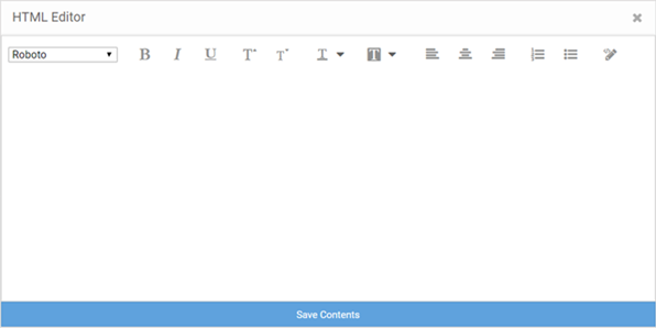
- Enter your text and use the HTML editor tools to set the font style, size, color and text alignment.
-
Use the
 tool to preview the content. Make changes if necessary.
- Select Save Contents to save and exit the editor.
Editing Image Widget
Use this widget to insert images in the splash page.

Note
The Image widget is not available for the 'Failure' web page.-
Select the
 icon to open the Image Settings panel.
The Image Widget Settings panel displays.
 Image Widget Settings
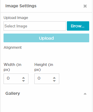
Upload Image Select Browse and navigate your local file system to locate and select the image file. Select Upload. The image is uploaded to the Gallery . Note: The following image file types are supported: .jpg, .jpeg, and .png.Alignment Use the alignment buttons to set the alignment of the image within the layout cell. Width and Height Use these options to change the image size. By default, an image auto-resizes to fit in the layout cell. Gallery The gallery displays user-uploaded images. Drag and drop an image into the image widget. Select  icon to remove an
image.
Editing HTML Widget
The HTML widget allows you to design the content of the selected section of the web page using HTML or JavaScript. Use this widget, to create the content of a specific section of the web page from scratch instead of using the system-provided widget content.

Note
Both HTML and JavaScript is supported.-
Select the
 icon to open the HTML editor.
The HTML Widget - HTML Editor panel displays.
 Create Splash Template - HTML Widget - HTML Editor
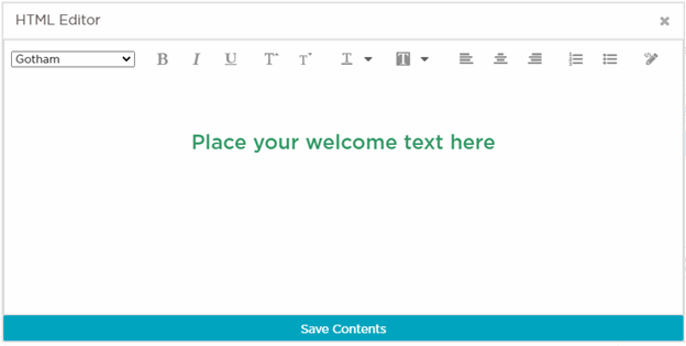
- Enter your HTML code or JavaScript and select Save HTML Contents to save and exit the editor.
Editing Slide Show Widget
Image slide-shows are an excellent means of enhancing user engagement and experience. Use this widget to add slide shows of images to the splash pages.
-
Select the
 icon to open the Slide Show Settings panel.
The Slide Show Settings panel displays.
 Create Splash Template - Slide Show Settings Panel
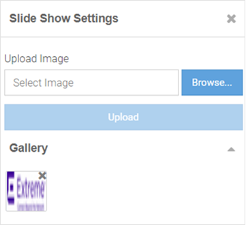
Drag and drop images from the Gallery to create a slide show. You can upload and delete images from the gallery as described in Step 20: Editing Image Widget.
Editing Video Content Widget
Videos enhance user engagement and experience. Make your web pages informative and attractive by adding didoes to your web pages.
-
Select the
 icon to open the Video Settings panel.
The Video Settings panel displays.
 Create Splash Template - Video Settings Panel
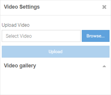
The Video Settings panel has the Upload Video and Video gallery options, similar to the Image Settings panel. Upload your video to the gallery, then drag and drop the video file into the widget.

Note
This widget uses HTML5 Video tag. The following image file types are supported: .mp4, .ogv and .webm. To ensure cross-browser compatibility, upload your video file in all three formats. For example, save the video 'test' as 'test.mp4', test.ogv', and 'test.webm'. Upload all three files to the video gallery at the same time.
Editing Button Widget
Button Widget is a simple and effective tool for inserting a button with hyper link to a web page. Use this widget to create a button that directs users to a predefined URL.
-
Select the
 icon to open the Button Settings panel.
The Button Settings panel displays.
 Create Splash Template - Button Settings Panel
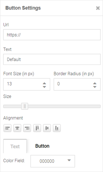 The Button Settings panel has the following fields:
Url field Use this widget to insert a button that is hyperlinked to a pre-defined page. In the URL field, enter the URL of the page the user is directed to on clicking the button. Text field Enter the text displayed on the button. Font Size (in px) Set the font size in pixels. Border Radius (in px) Set the button's border radius in pixels. Size Use the slider to set the button size. Alignment Set the button's alignment within the layout cell. Text Use this tab to set the color of the text appearing on the button. Button Use this tab to set the color of the button itself.
Editing Registration Form Widget

Note
The Registration Form widget is available only for the 'Landing' web page.-
Select the
 icon to open the Registration Form Settings panel.
The Registration Form Settings panel displays.
 Create Splash Template - Registration Form Settings Panel
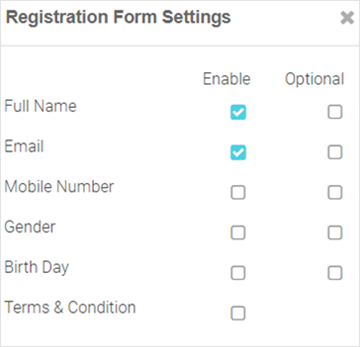
Insert a registration form for first-time users. First-time users are required to enter information in the fields displayed on the page. The available field options are: Full Name, Email, Mobile Number, Gender, Birth Day, Terms & Conditions. Each field has an associated Enable and Optional checkbox. Select Enable to add the field to the form. Select Optional to make the field optional.

Note
The Terms & Conditions option adds the Terms & Conditions Widget at the end of the page.
Editing Login Options Widget
Use the Login Options Widget if you wish to enforce a 'Accept and Connect' or go to 'Login' page action.
-
Select the
 icon to open the Login
Options Settings panel.
The Login Options Settings panel displays.
 Create Splash Template - Login Options Settings Panel
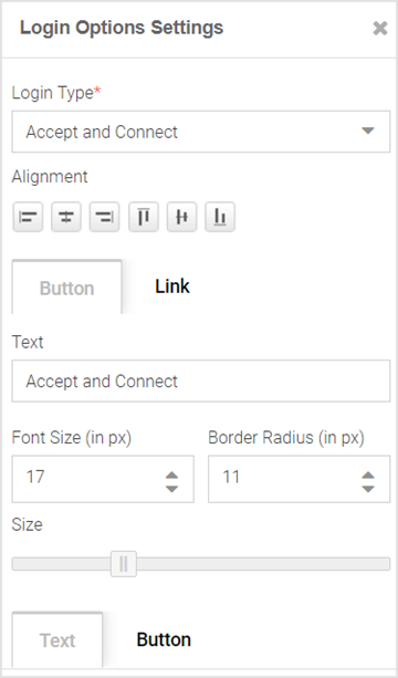 The Login Options Settings panel has the following fields:
Login Type Select one of the following login type action: - Accept and Connect - redirects user to the accept and connect page.
- Login - redirects user to the login page.
Alignment Set the alignment of the button/link within the layout cell. Button Select to insert a button. Link Select to insert a hyperlink. Text If selecting the 'Button' option, specify the text on the button. If selecting the 'Link' option, specify the hyperlink text. Font Size (in px) Set the font size in pixels. Border Radius (in px) Set the button's border radius in pixels. Text/Button Selecting the 'Button' option, enables these tabs. Use these tabs to set the color of the text on the button and the color of the button itself. Font Size/Font Color Selecting the 'Link' option, enables these tabs. Use these tabs to set the font size and color of the hyperlink text.
Editing Social Options Widget
Use this widget to add user authentication through social media applications. Guest users can use their Facebook, Google or LinkedIn account credentials to authenticate and access the internet.
-
Select the
 icon to open the Social Options Settings panel.

Note
The Social Options Settings widget is available only for the 'Landing' and 'Login' web pages.
Note
Ensure that the social media is added as an authenticator on the portal.The Social Options Settings panel. Create Splash Template - Social Options Settings Panel
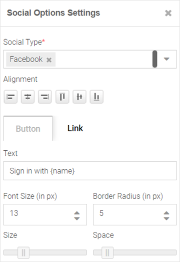
Social Type Use this drop-down menu to select the social media sign-in options. Note: Available options are: Facebook, Google or LinkedIn. You can add more than one social-media login option.Button Select to insert a button. Link Select to insert a link. Alignment Set the alignment of the button/link within the layout cell. Text Enter the social media name in the 'Sign in with {name}' field. For example: Sign in with Facebook Font Size (in px) Set the text font size. Border Radius (in px) Set the button's border radius in pixels. Size Use the slider to set the button size. Space Use the slider to set the space between buttons.
Editing Terms and Conditions Widget
Use this widget to insert 'Terms and Conditions' and 'Privacy Policy' hyperlinks with pop-up texts.

Note
The Terms and Conditions widget is available only for the 'Landing' web page.-
Select the
 icon to open the Terms and Conditions Settings panel.
The Terms and Conditions Settings panel displays.
 Create Splash Template - Terms And Conditions Settings Panel
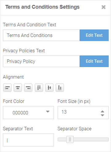
Terms And Conditions Text Select the Edit Text button to open the HTML editor. Enter the terms and conditions that the captive portal user views on clicking the Terms And Conditions link. Privacy Policy Select the Edit Text button to open the HTML editor. Enter your company's privacy policies that the captive portal user views on clicking the Privacy Policy link. Alignment Set the alignment of the links within the layout cell. Font Color Set the link text font color. Font Size (in px) Set the link text font size in pixels. Separator Text Set the separator between the two links. Separator Space Use the slider to set the space between the separator and the links on either side.
Editing Login Form Widget
Use this option to insert a simple login form. A login form is an easy and simple mode of authenticating already registered guest users.
-
Select the
 icon to open the Login Form Settings panel.
The Login Form Settings panel displays.
 Create Splash Template - Login Form Settings Panel
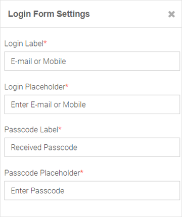
The login form allows guest users to enter their username and passcode registered with the ExtremeGuest Essentials database. The form has two fields. Each of these fields has two parameters: The field label and the text displayed within the field placeholder. Customize the field labels and the prompt-text displayed within the placeholder.
Editing WiFi Logout Widget
Use this option to insert a WiFi-Logout button. This option allows successfully authenticated guest users to log out from the connected WiFi.
-
Select the
 icon to open the WiFi Logout Settings panel.
The WiFi Logout Settings panel displays.
 Create Splash Template - Logout Button Settings Panel
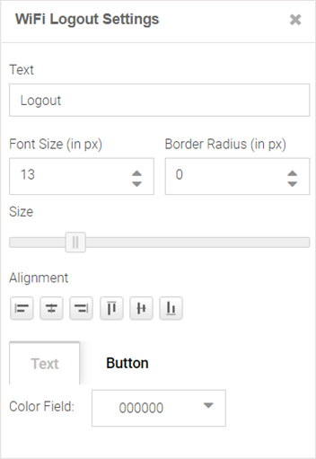
Use the WiFi Logout Settings panel to customize the logout button as per your requirement. This panel provides settings similar to the Button Settings panel with one exception, there is no URL field in the WiFi Logout Settings panel. For more information, click here.
Editing Redirect Widget

Note
The Redirect widget is available only for the 'Welcome', 'Failure' and 'No Service' web pages.-
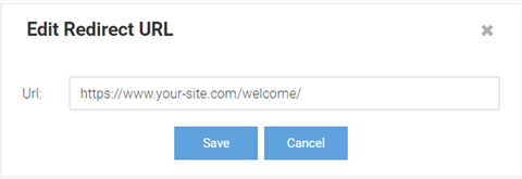
In the Edit Redirect URL
box, specify the URL of the web page to which your users are to be
redirected.
The Edit Redirect URL window displays.
 Create Splash Template - Edit Redirect URL Box
-
Select Page Settings.
Use the page settings fields to either upload a background image or select a
background color for the remainder of the web page that lies outside of the
Theme or Widget pane.
The Page Settings window displays.
 Create Splash Template - Select Page Settings Options
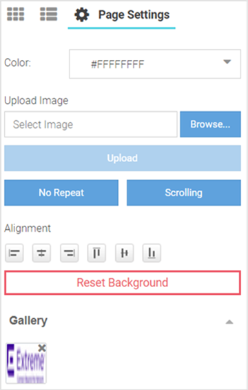
- Color
- Use the built-in color palette to select the background color of the splash template. This background color can be viewed in the Preview mode.
- Upload Image
- Use this option to upload and insert a background image. Select Browse and navigate your local file system to locate and select the image. Select Upload. A thumbnail of the uploaded image is added to the Gallery section. You can upload multiple images, however, only one image can be used as the background image at a time.
- No Repeat/Repeat/Horizontal Repeat/Vertical Repeat
- This button changes the background image repeat status. If the image is small and does not cover the entire page, you can repeat the image as multiple tiles in the background. No Repeat prevents the image from displaying as tiles. Repeat makes the image repeat horizontally and vertically. Horizontal Repeat makes the image repeat horizontally. Vertical Repeat makes the image repeat vertically.
- Scrolling/Fixed
- This button changes the background image scrolling state. If the page is long and scrolls, you can set the image to scroll along with the page content by setting the image state to Scrolling. In the Fixed state, the background image remains still while the content scrolls.
- Alignment
- These buttons align the image horizontally (left, center and right) and vertically (top, middle and bottom).
- Reset Background
- This button removes background image and color.
-
Select the preview
 icon to review your page design.
The splash page displays in the preview mode.
 Create Splash Template - Device Type and Orientation Settings
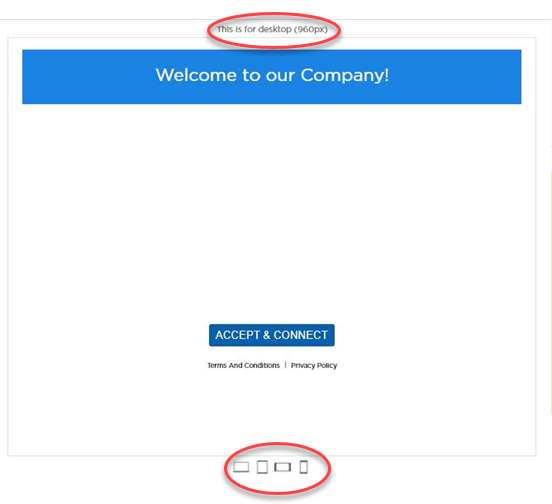 Use the device orientation icons at the bottom of the screen to preview the splash page as seen on different devices and orientation. The following viewing options are available for:
- Large screen devices like laptops (960 px wide)
- Tablets and other wide screen devices (768 px wide)
- Mobile devices with landscape orientation (568 px wide)
- Mobile devices with portrait orientation (320 px wide)
- Exit the preview mode. Make changes to the page design if needed.
- Select Save to save and exit.
- Select Cancel to exit without saving.
