Visualizations configure how Live RF heat maps are visually displayed. Each visualization contains items that are identified by a color.You can view the visualizations (shown below) by selecting one from the Visualization drop-down menu. While viewing a visualization, you can change the default color of an item by clicking on the color and then selecting a new color from the color chart. You may also change the threshold (if active) by typing in a new value.
| Visualization | Default Colors |
|---|---|
|
Signal Quality (Threshold inactive) |
 |
|
Coverage Hole (Threshold inactive) |
|
|
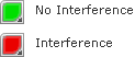
Co-Channel Interference (default Threshold = -120) |
 |
|
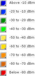
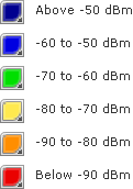
Signal Coverage (Threshold inactive) |
 |
|
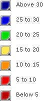
Signal To Interference (Threshold inactive) |
 |
|
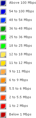
Peak Data Rate (Threshold inactive) |
 |
|
Noise (Threshold inactive) |
 |
|
Coverage Overlap (Threshold inactive) |
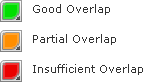 |
|
Channel Coverage (Threshold inactive) |
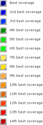 |
|
Service Counts (Threshold inactive) |
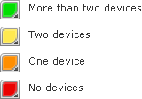 |